Curaco C.I
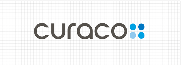
Curaco’s 4-Dot Logo
Curaco’s 4-dot logo is a visual representation of an intertwined virtuous circle.
The 4-dot logo has dots with different hues and can be expressed in bluish, greenish, reddish hues.
The logo visually represents the virtuous cycle of transitioning from a patient to a caregiver.
What we envision is witnessing patients who have received Curaco’s
sincere care recover and become healthy enough to serve as caregivers themselves.
Curaco makes this happen with its creative ideas
and innovative technologies. This philosophy is succinctly expressed as
‘Care & Better’, meaning “We Care to help you get Better”.
Curaco’s Colors
5 Keywords of the 4-Dot Logo


The Corporate Philosophy Behind the 4-Dot Logo
Curaco and Its Customers
Curaco, with a sincere ‘Caring’ heart, manufactures and supplies products in creative ways.
The customers who use Curaco’s products become ‘Better’ and they provide Curaco
with positive feedback. This is the virtuous cycle Curaco strives to establish for its customers.
Curaco and Its Employees
Curaco ‘Cares’ for its employees and provides them a creative environment to work in.
The employees then improve and become ‘Better’. With a sincere ‘Caring’ heart,
the employees also strive to make Curaco a ‘Better’ company.
This is the virtuous cycle Curaco strives to establish for its employees.